Remix Mies, an entry on Eikongraphia

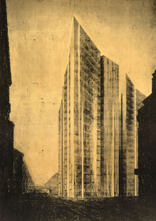
Mies van der Rohe – Design Friedrichstrasse 1919
Text and image source: eikongraphia.com
03.16.06
The almost unnoticeable iconography of the `critical’ architecture of Mies van der Rohe has a long ignored overlap with the `projective’ architecture of Rem Koolhaas (OMA) and Alejandro Zaero-Polo (FOA).
In recent years the work of seemingly very different architects such as Asymptote, MVRDV, Claus en Kaan, UN Studio, Wiel Arets, Neutelings Riedijk, OMA and FOA shows striking similarities as a result of a common interest in using iconography in the design-process. This is an effect of the shift from a critical towards a projective practice. At this moment there is an international debate going on between architects that hold on to the critical theory, and architects that think that the critical project is exhausted and has to be replaced by a projective practice. Opposed to a critical architecture that resists consumer society, Robert Somol and Sarah Whiting position a projective architecture that looks for opportunities within the capitalist society and exploits these. 1 To clarify this difference I will confront the critical architecture of Mies van der Rohe with the projective architecture of Rem Koolhaas (OMA) and Alejandro Zaero-Polo (FOA). We might find a partial answer to the question – what does a projective building look like?
Mies van der Rohe
The American architectural historian K. Michael Hays recognizes in architecture a dialectic between ‘Culture and Form’.2 On the one hand there is an architecture as a direct formation of the contemporary culture, on the other hand there is an architecture that withdraws from time-specificity into autonomous form. Every architecture finds its place somewhere in between those two poles. According to Hays the dialectic between culture and form finds its synthesis in ‘Critical Architecture’. Hays develops his concept of a critical architecture with an analysis of the work of Mies van der Rohe. Before we move beyond this concept, I will first summarize the argument of Hays here shortly.
One of the most important intellectual problems of the first half of the twentieth century according to Hays is the concern about the chaotic modern city life. With the industrial revolution modernity had accelerated, and had drastically altered the image of the modern city with advertisements, department stores, shopping passages, cars, etc. It was up to the architect to reveal this ‘vulgarity’ – as Hays consistently calls it – and to propose alternatives. Many architects, philosophers and artists struggled with this issue in the first half of the twentieth century. In this light one should regard the work of Mies van der Rohe – says Hays.
In 1922 Mies van der Rohe designs a skyscraper with an irregular perimeter that is enclosed with a glass curtain wall. The design is a follow-up of his skyscraper project in 1919 for the Friedrichstrasse in Berlin. The randomly curved glass-façade of the 1922-project is not the result of an internal, autonomous form. The glass surface has its own logic and is dependent on- and connected with the city-life through the properties of the glass. But the design is also not a direct effect of its situation; it is a critical interpretation of it. The glass curtain wall – alternating transparent, reflecting, and refracting depending on the sun and the point of view – reflects and deforms the image of the city, and places the building in a specified time and place. The mimicking of the city is read by Hays as the negation of it.
Six years later, Mies van der Rohe has developed his architecture a step further. All his designs of that time show entirely glazed rectangular blocks. These blocks could be reproduced on every location, without a significant change in their form. For Mies the repeating construction system is a contemporary, cultural given. Just as with the glass skyscraper of 1922 the building masses vary here at random. In his design for the Alexanderplatz in Berlin Mies van der Rohe does not design a round form that would enclose the round square, but instead the rectangular buildings are scattered around without any center.
The façade is not a direct expression of the construction system, but absorbs, reflects and refracts its surroundings. The buildings reflect each other and thereby cut a void in the cultural space of the city. Through the eyes of Hays, Mies van der Rohe makes a ‘clearing’ in the space between his buildings – an open spot, a silence in the nervous and chaotic metropolis. Critical architecture according to Hays is a cultural-informed product, which defines itself as a discontinuity and difference with other cultural activities.
Hays examines his thesis with Mies’ German Pavilion in Barcelona of 1929. The design is constructed as a large horizontal roof-plane under which columns and vertical planes of marble and glass are positioned. As a result of the apparently random positioning of the elements one experiences the building as an assemblage of different parts and different materials. Because all surfaces heavily reflect the sunlight and each other, all materials are transformed in their appearance – marble becomes transparent, the steel columns become almost invisibly, the glass is so dark that it becomes a mirror, etc. The fragmentation and distortion of the space is total. When you move through the building these elements are in an ongoing flux. The building itself becomes an event that is continuously being reproduced.
Hays concludes: “Though it exists to a considerable extent by virtue of its own formal structures, it cannot be apprehended only formally. Nor does it simply represent a preexisting reality. The architectural reality takes its place alongside the real world, explicitly sharing temporal en spatial conditions of that world, but obstructing their absolute authority with an alternative of material, technical, and theoretical precision. A participant in the world and yet disjunctive with it, the Barcelona Pavilion tears a cleft in the continuous surface of reality.â€
In his seminar at the Delft School of Design3 Hays developed his concept of a critical architecture further with the example of the Seagram Building in New York of 1969. The Seagram Building has been put back of the street to make room for a plaza – again a ‘clearing’.The reliëf of the I-beams of the facade produces a flickering image; you do not know exactly where the plane of the facade is positioned. More important is that the sketches Mies made of the Seagram show a precisely rendered plaza, with only a rapidly drawn line in the background as an indication of the building itself. Most of the drawings Mies made for the Seagram are of the sculptures and fountains on both sides of the plaza. Mies draws series of blob-like sculptures, that however never satisfy him. In the end no sculptures at all are placed.
Hays argues that with the Seagram the building becomes surface. Especially because culture is manifesting itself in the sixties by means of the surface – billboard, label, television – the surface itself is the appropriate medium to reject this culture. Hays compares the repetition in the surface of the facade with the art that Andy Warhol made in the time. Andy Warhol repeted for example the image of the Coca-Cola bottle or the Campbell’s Soup tin to an abstract plane/surface. With the repetition of the product a distance to the product is created, so it can be negated, rejected. The abstract surface is a negation of the vulgar city.
Striking about the drawings of Mies van der Rohe is that the centrally placed figures of people and sculptures are very articulated and very precisely rendered, while the buildings themselves are only lightly sketched or presented as abstract planes. Hays only notes that these elements play a role in the drawings of Mies, but cannot specify their exact meaning. In the eyes of Hays the sculpture-studies for the Seagram Building or the sculpture of ‘The Dancer’ of George Kolbe in the German Pavilion in Barcelona are only footnotes in the oeuvre of Mies. The real meaning of the sculptures is overlooked.
The drawings that Mies made of his early work look very different. Is seems that Mies in his early work, such as the Friedrichstrasse project and the Skyscraper project, is thinking his buildings as contemporary icons in the city. The optimistic metropolitan environment in the Berlin of the 1920s and 1930s were similar with the situation of this time in New York. Berlin strived to become the metropolis of Europe, and the planning of skyscrapers appropriated that goal. In his study of Lichtarchitektur Dietrich Neumann states that both Berlin and New York started to design the image of the city at night in the twenties and thirties. Mies notes with a design for a department store in 1928 that the illuminated advertising was not necessarily limited to a small band on the façade. Instead the whole building could become an illuminated sign: “In the evening it represents a powerful body of light and you have no difficulties in affixing advertising [which] … will have a fairy–tale effect.â€4
Mies thinks his early architecture as sculptures. Later on he will part the architecture from sculpture, both in his drawings as in his practice. Architecture and sculpture become different but complementary elements. Mies’ architecture does not make just a clearing as Hays suggests. The architecture literally and figuratively makes space for the figures of people and sculpture.
Decoding – recoding
The idea that literal en figural space has to be made for new objects seems to have a resemblance to the concept that the French philosophers Gilles Deleuze and Felix Guattari formulate in their description of the machinery of desire.5 A human being has continuously new experiences. Each time a desire is fulfilled one experiences a positive charge. Deleuze and Guattari state that the production of experiences is balanced by a process of experience recording; an un-doing of the experiences. This way one remains in a constant hunger for new experiences. First a ‘decoding’ has to take place, before a new ‘recoding’ is possible. The construction of a building is a recording of a situation, which has been advanced by a decoding of the location – cutting down trees, demolishing existing buildings, etc. In architecture the decoding and recoding have both a physical and mental side. The decoding of Mies is physical because of its literally emptying of space, and mentally because the abstract planes put the commercial and cultural space on a distance. The urban space that the decoding of Mies produces, generates according to Hays possibilities for alternative realities.
The decoding of a place is about the decoding of space, which is always three-dimensional. In tectonic sense a building always needs a groundwork that decodes and recodes the site. Buildings like the Sydney Opera House of Jorn Utzon or the Casa da Musica in Porto of Rem Koolhaas/OMA decode and recode the site with a terrace-like groundwork. This decoding and recoding is comparable to the Classical Architecture in which columns are placed on a basement.
With Modernism the scale of the decoding dramatically increases. For the first time large horizontal areas are decoded by planes of sand. Mies van der Rohe decoded the complete location of the IIT in Chicago. Mies has a very specific contribution to the development of the decoding: he couples a horizontal decoding to a vertical decoding by means of vertical planes and volumes. The decoding of the plaza of the Seagram Building draws its meaning mainly of the enormous plane of the façade of the building in front of it. The walls of the German Pavilion in Barcelona also function as a decoding, and work together with the horizontal plane of water in the back of the pavilion. In the Barcelona Pavilion and more articulate in the Neue National Galerie in Berlin, we find the third technique of decoding: the hovering horizontal plane. All space under this plane is decoded and minimally recoded.
Architecture is always both a decoding and recoding. The proposition I want to make here is that in the first projects of Mies the decoding and recoding still coincide, but that Mies draws them apart in his later projects. The architecture of Mies becomes an abstract background that makes a clearing (decoding), which can subsequently be conquered by the figures of people and sculpture (recoding). The sculpturality that in his early works encompasses the whole building, is later reduced to a more compact but intensified essence: people themselves, or pure sculpture. The radical abstraction of the architecture of Mies van der Rohe is out of necessity counterbalanced in the accentuation of the figures of people or the more literal or more metaphorical representation of the figures of people in sculpture. The bold and empty square in front of the Seagram Building both accentuates the movements and figures of the human characters and – in the conception of Mies – should sustain such dynamics in sculpture for the moments that the square is less flocked with people. In the architecture of Mies the abstract plane and the iconographical form are placed on a distance of each other – facing each other, balancing each other. Abstraction and form, decoding and recoding, can be drawn apart, but can never be separated because of their connection.
In Modernism the abstract plane and volume is in different ways combined with form. Apart from the human figure and sculpture, the free-form large-span building next to the abstract slab is often used. But by far the most dominant ‘form’ is that of nature; hills, trees, plants. The contrast between the abstract plane and volume and the natural form finds its climax in the collages of Superstudio.
In this light the current interest of architects like Herzog & de Meuron and Erick van Egeraat in natural patterns and forms is a break with past, because the abstract plane and (natural) form are no longer seperated, but again coincide.
Though the inseparable combination of decoding and recoding is inherent to all architecture, the way the instrument is used differs enormously. An example of how decoding and recoding can be developed in architecture is the Sphinx-dwellings in Huizen by the Dutch architects Neutelings Riedijk. The project consists of a long uniform row of houses along a quay and five apartment buildings in the water in the form of Sphinxes. The long row of houses decodes the situation by hiding the suburban neighborhood behind it, and recodes the situation minimally by presenting a uniform and abstract front along the quay. The recoding of the row houses is that abstract that there is figurative maximum space made for the iconographical form of the Sphinx. The plane of water adds to the composition an extra minimal recoding, after a decoding of the ground.
A second example of a building in which the architectural decoding and recoding are very recognizable combined in a hybrid mix is the new University Library of Utrecht (UBU) of the Dutch architect Wiel Arets. The repetition of the image of bamboo in the façade is an almost literal echo of the repetition of the Coca-Cola bottle of Andy Warhol. The abstract plane that is created with the repetition is explicitly meant as a decoding. The half-transparent alabaster skin forms the abstract background for the iconographic image of a clouded sky, as the architect calls it. The black-concrete closed boxed volumes that house the book storage are floating in the building envelope like clouds. The spaces in between the hovering clouds are kept open and programmed as study spaces.
When every architecture at the same time decodes and recodes, the difference between a critical architecture and another architecture is not it’s decoding. Critical architecture differs because it hardly recodes. The protagonists of a critical architecture such as K. Michael Hays put a one-sided emphasis on the decoding and ignore the recoding of the space.
Rem Koolhaas & Alejandro Zaero-Polo
The idea that the decoding of a place precedes the recoding of it is described by Rem Koolhaas in his study of Coney Island and Manhattan in New York.6 The enveloping wall around the theme parks on Coney Island effectively decodes the site, so it can be recoded with a theme. On Manhattan the grid takes over the function of the wall on Coney Island as the medium through which the location is decoded. Each block in the grid can be potentially themed. The project ‘City of the Captive Globe’ illustrates that. It is striking that Rem Koolhaas and Elia Zenghelis also draw icons and sculptures as possible infill to the blocks in grid – recoding through iconography. Koolhaas realizes that the skyscrapers on Manhattan develop just one iconography, the tower, but that there are many more possibilities.
In his oeuvre Rem Koolhaas continued to work on the thematic of Manhattanism. Recent projects such as the CCTV in Beijing, Casa da Musica in Porto, the Seattle Public Library, and the Dutch Embassy in Berlin can all be related to the idea of the skyscraper. By designing the Embassy Building as a freestanding fat ‘skyscraper’ the decoding effect of the grid in Manhattan is simulated. The direct surroundings of the building are placed on a distance by the narrow slab of housing. The almost Miesian design of the slab decodes the surroundings and accentuates the iconography of the circling trajectory.
The designs of Rem Koolhaas are not only alternatives to the iconography of the tower, but also leave more and more the idea behind of the lobotomy of the façade. The façade of a skyscraper can hardly or not be seen as a representation of the program behind it. In the early designs of Rem Koolhaas, such as the design for the Cruise Terminal in Zeebrugge or the design for Amsterdam Central Station, the contrast between façade and the program is pulled to extreme. In recent projects the focus has shifted to a much closer connection between the façade and the iconography of the mass and the program of the building. The iconography of the building is no longer an a-priori form in which the program is stuffed, but becomes an expression of the program and the organization of the building.
Whereas several architecture-critics put Rem Koolhaas forward as projective, Alejandro Zaero-Polo is the first architect that labels himself as projective. It is not by chance that the strategies of OMA and FOA currently overlap. Both offices explore the possibilities of iconography in architecture. I define ‘iconography’ here as referring to an image of our image-culture. For example the ING House of Meyer & Van Schooten in Amsterdam looks like a hovering shoe or ice-skate. OMA and FOA use iconography in the design-process by operating an image that both organizes the building and communicates easily to client and the general public. In his description of his ‘projective strategy’ Zaero-Polo calls it ‘form with a double agenda’.7 The material organization of a building that emerges from the program during the design process is melted with an image that both constitutes the organization and can communicate/sell the building. The images that are being used are not selected in advance, but come floating to the surface during the design-process. The images are selected from the site and location of the building and/or the program. The Yokohama Cruise Terminal of FOA for example couples the image of the Hokusai Wave, a local name for tsunami, with the organizational system of waving and folding planes. The iconography is therefore not limited to the façade, as is the Duck-model of Venturi & Scott Brown, but affects the whole material structure of the building.
The success of this projective strategy is illustrated by the fact that in previous years more and more architects are working this way. This strategy seems to fall under the concept of Exhibitionism, as Stanislaus von Moos defines it.8 For more than a century iconography has been applied in Pavilions for the World Fairs. Think for example about projects like the Atomium of Andre Waterkeyn, or the Philips Pavilion of Le Corbusier, both at the fair in Brussels in 1958. Since the Guggenheim Museum in Bilbao of Frank O. Gehry iconography has been rediscovered and is more and more applied. New is that this iconographical architecture is no longer devised as temporary pavilions, but as sustainable architecture.
Architecture is about decoding and recoding. Critical architecture distinguishes itself because the decoding coincides with a minimal recoding. K. Michael Hays only emphasizes the decoding in the work of Ludwig Mies van der Rohe and overlooks the subtle recoding. In the current projective practice of Alejandro Zaero-Polo and Rem Koolhaas the decoding is combined with the expressive recoding of an iconographical form. The `blobs’ that Mies van der Rohe drew for the plaza of the Seagram Building are a projective seed that have finally come into bloom in the work of architects like Alejandro Zaero-Polo and Rem Koolhaas.
Sources
1 Somol, Robert en Whiting, Sarah, Notes around the Doppler Effect and other moods of Modernism,
in Perspecta 33, 2002
2 Hays, K. Michael, Critical Architecture, Between Culture and Form, Perspecta 21, MIT Press, Cambridge 1984,
3 Hays, K. Michael, DSD Seminar Projective Practice, TU Delft 2005,
4 Neumann, D., Architecture of the Night, Prestel Verlag, Munich 2002
5 Deleuze, G., Guattari, F, Anti-Oedipus: Capitalism and Schizophrenia, Paris 1983,
6 Koolhaas, R., Delirious New York, The Monacelli Press, New York 1978,
7 Zaero-Polo, A., The Hokusai Wave, Volume, Amsterdam 2005,
8 Moos, S. von, Nicht Disneyland, Scheidegger und Spiess Verlag, Zürich 2004
This article has previously been published in Dutch in ‘de Architect’ of March 2006 and in ‘Pantheon// Projective Landscape’, February 2006.
Lascia un commento
You must be logged in to post a comment.


